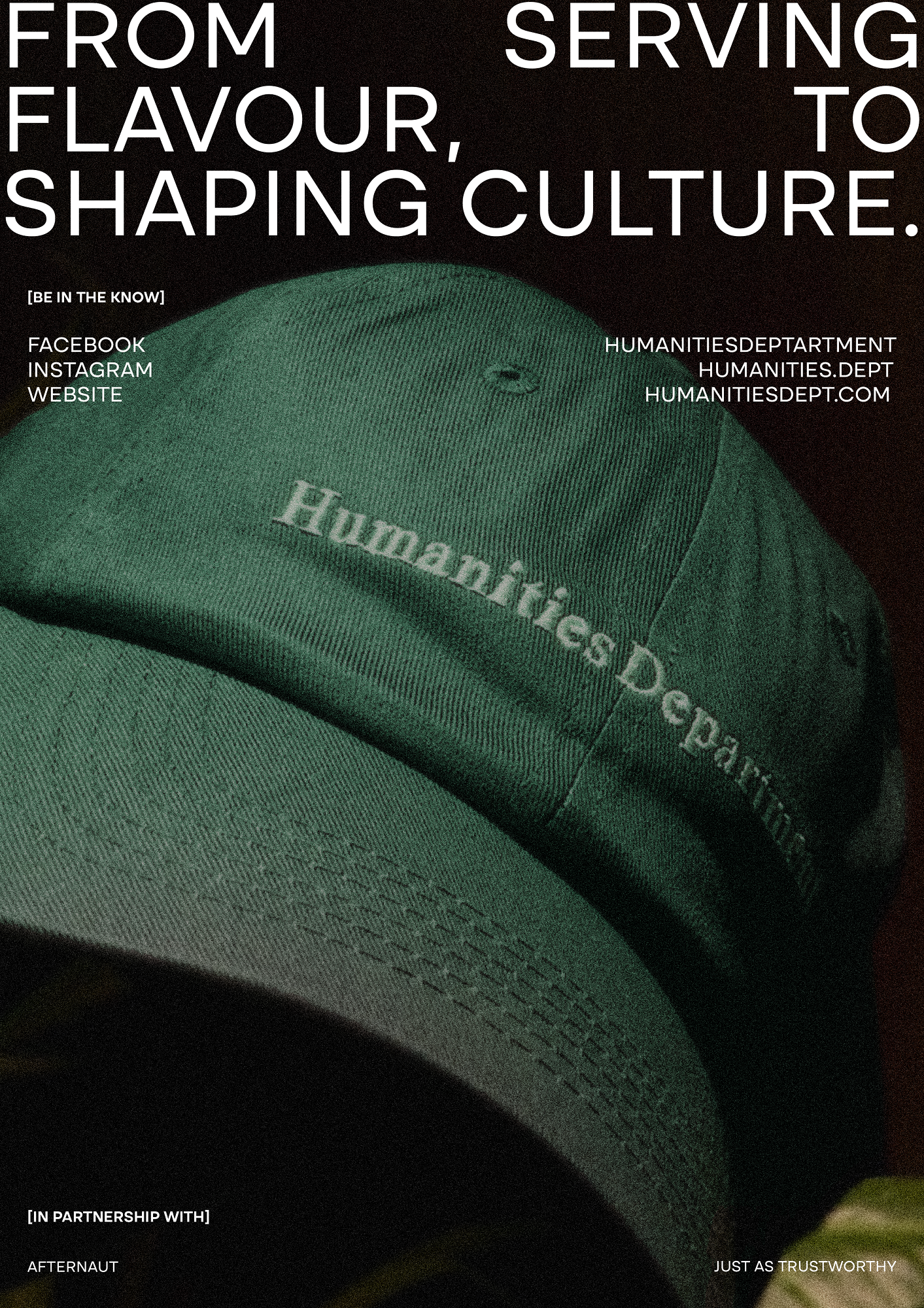
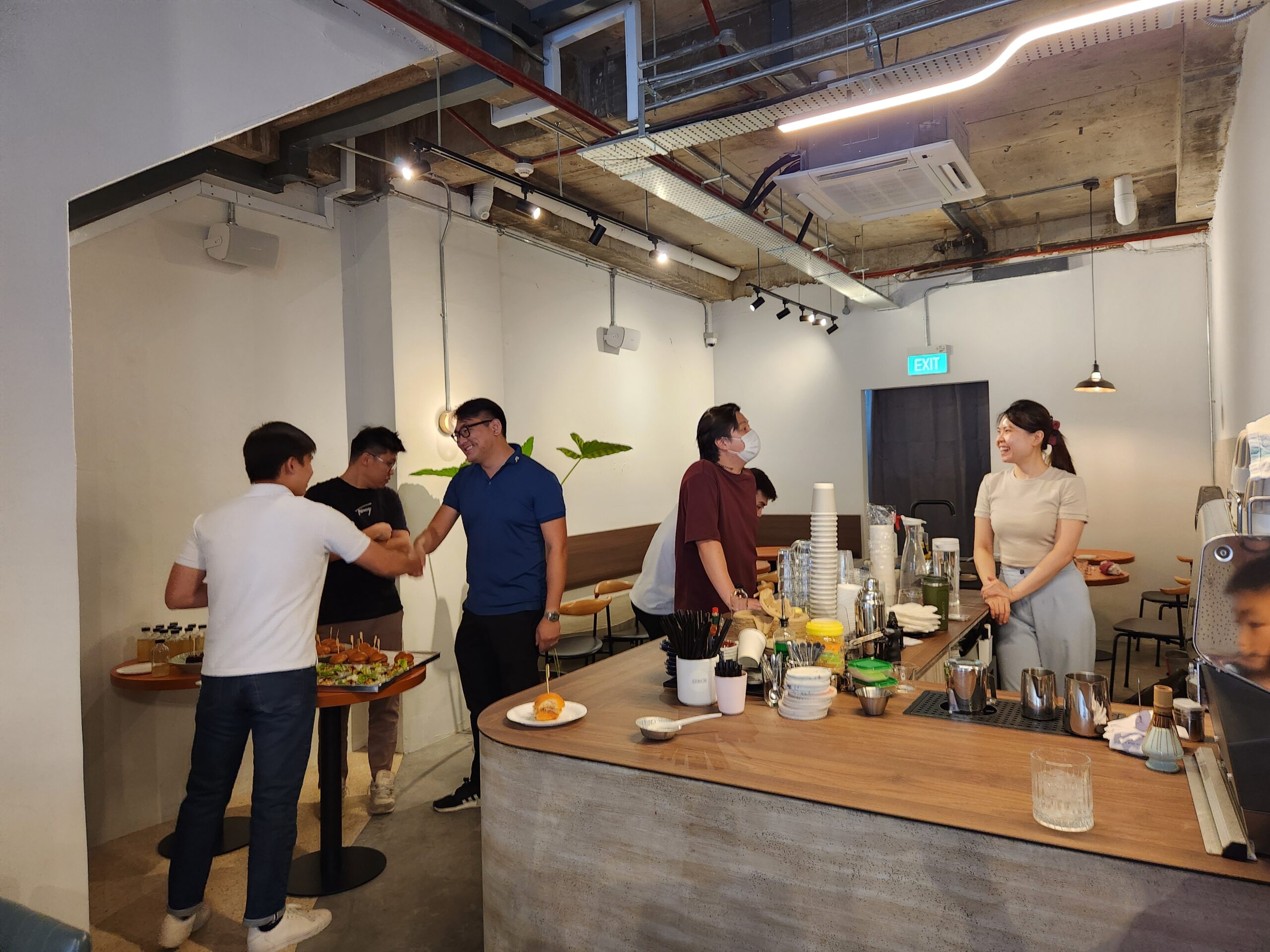
The Social Kitchen ends the year on a high note, and steps into 2025 sporting a new look, a new brand name, and a new partner — The Afternaut. Besides refreshing its spaces with a trendy and more street ready look, the new brand also teases a series of new merchandise and exciting plans to come.
It is simple, enjoyable moments like these that help bring people closer together and we aim to bring more of such opportunities for interaction in Geylang at our next gathering.
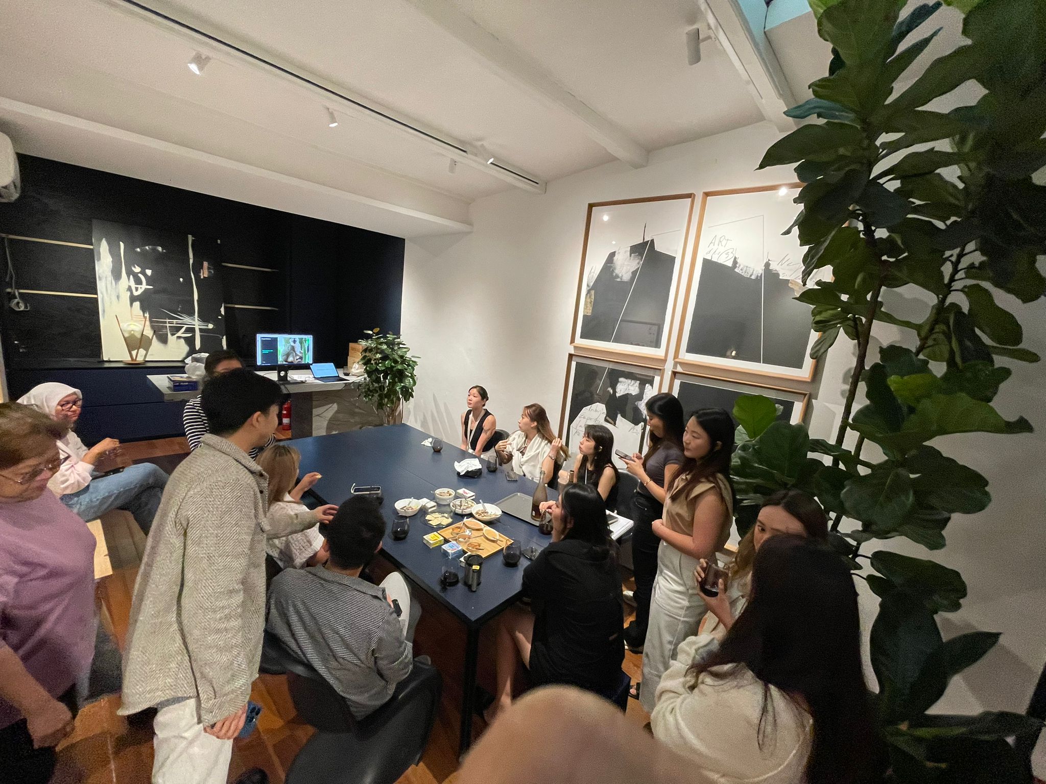
We all love a cute animal, and animal memes were sent amongst friends and colleagues even before the days of social media (anyone remember receiving icanhazcheezburger memes?). So when the team from Mandai X asked us if we wanted to send Mandai animal memes to each other in the office, we obviously said yes!
The whole idea of being in a heritage space is very exciting, as we get to build our own world on the inside of a shophouse, and be as versatile and adaptable as we want.
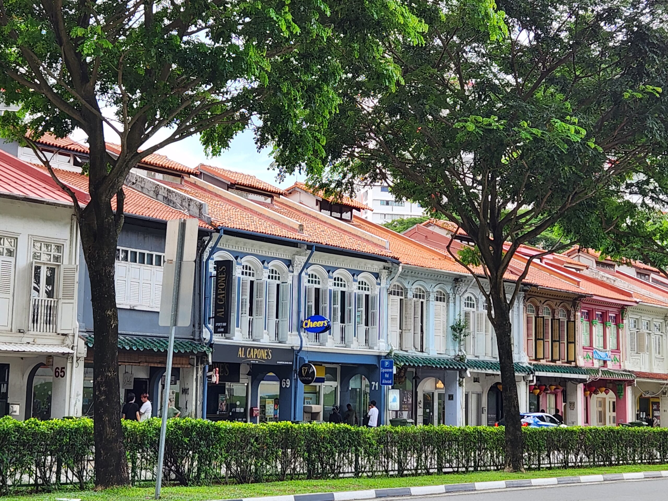
These days, shophouses aren’t just for F&B establishments. The Afternaut is working with Meir Collective, a real estate investment and management company, who own multiple shophouses, and we’ve noticed a rising trend of high street and luxury brands opening up in shophouses in Singapore. The Coach Play Singapore Shophouse and House of Birkenstock opened to much excitement as they sprinkled a little magic onto our heritage shophouse rows.
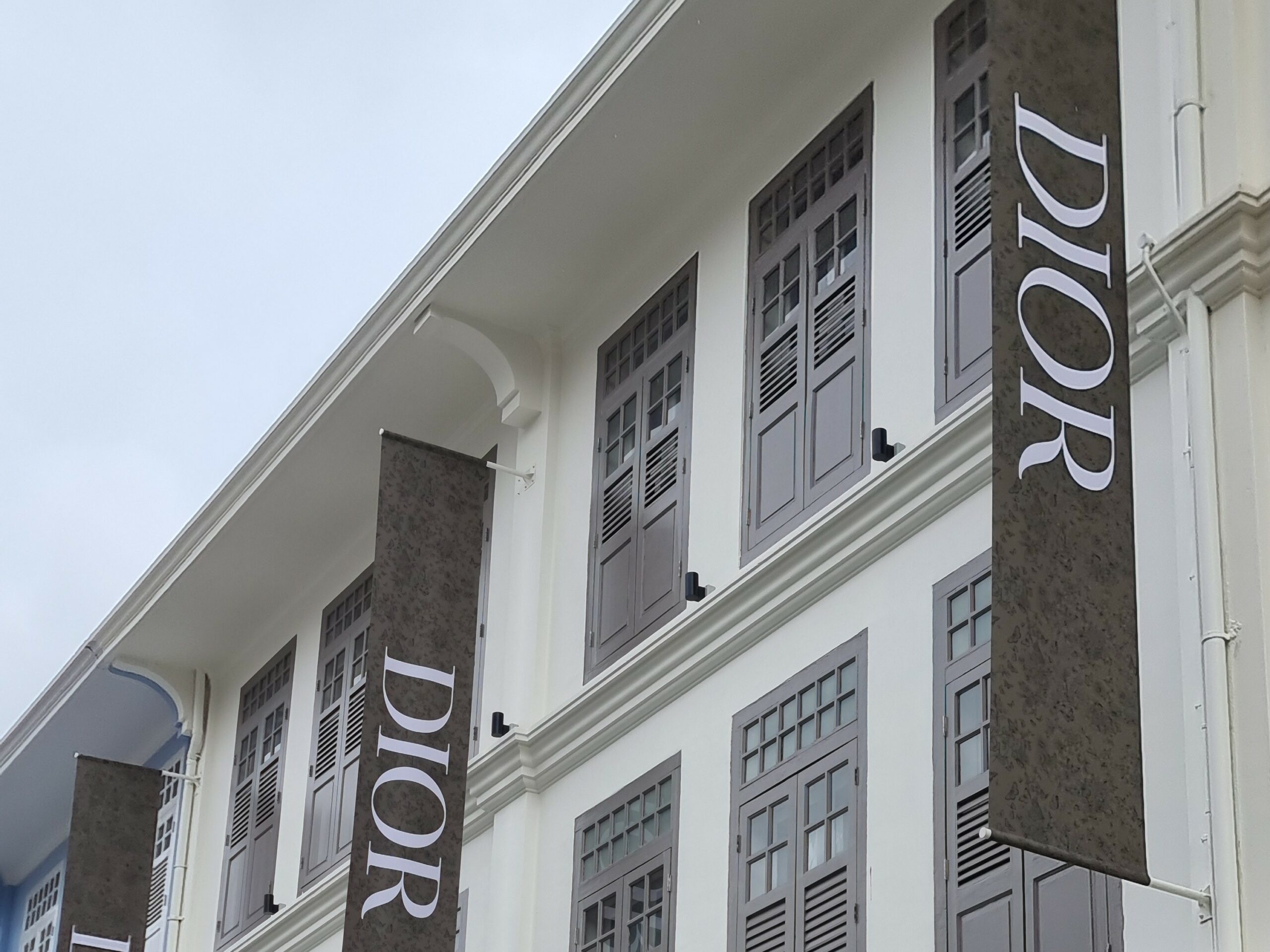
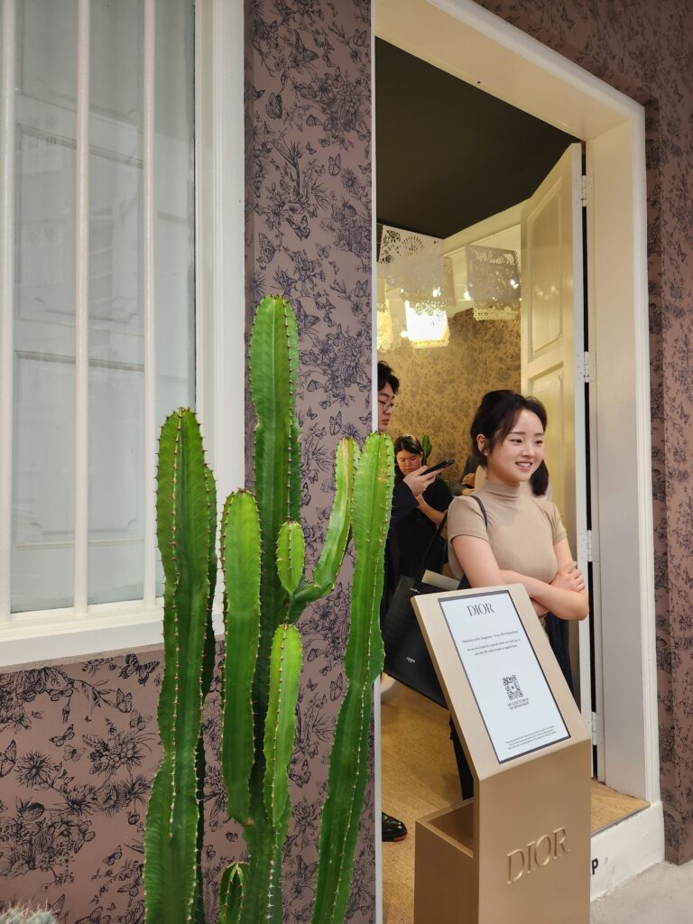
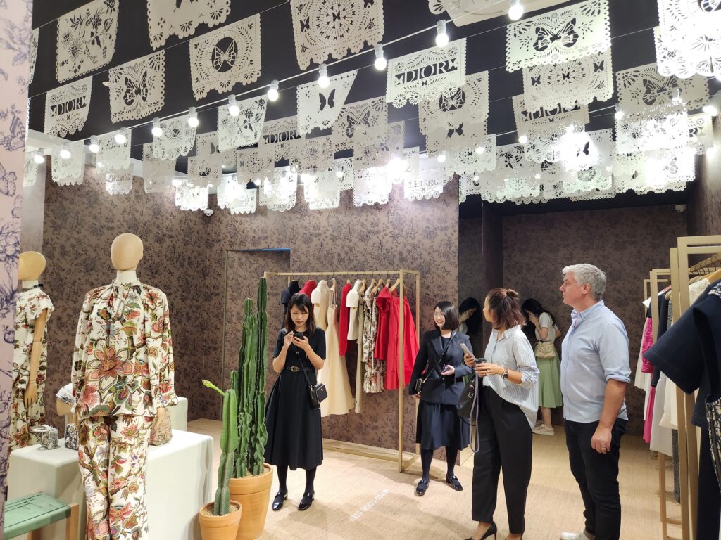
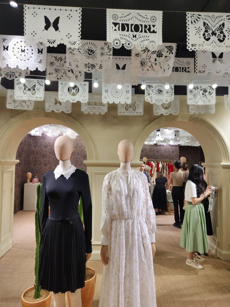
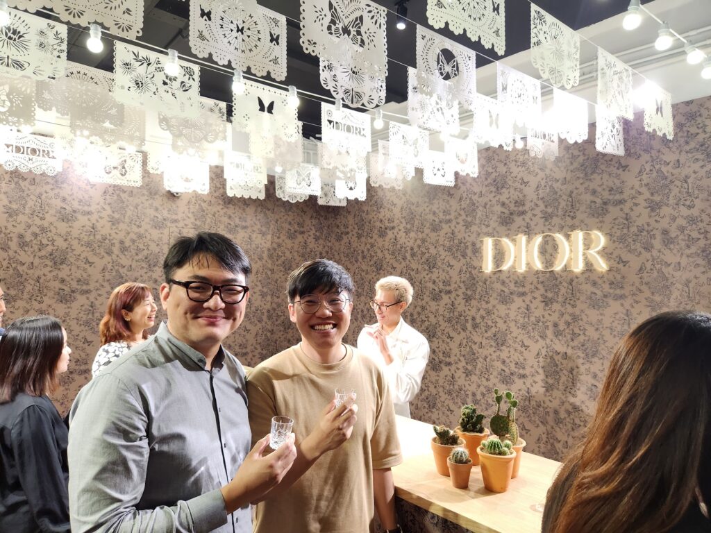
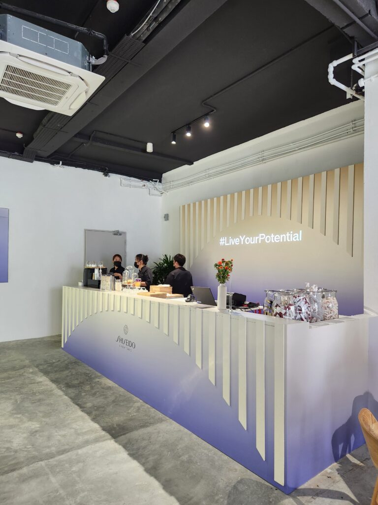
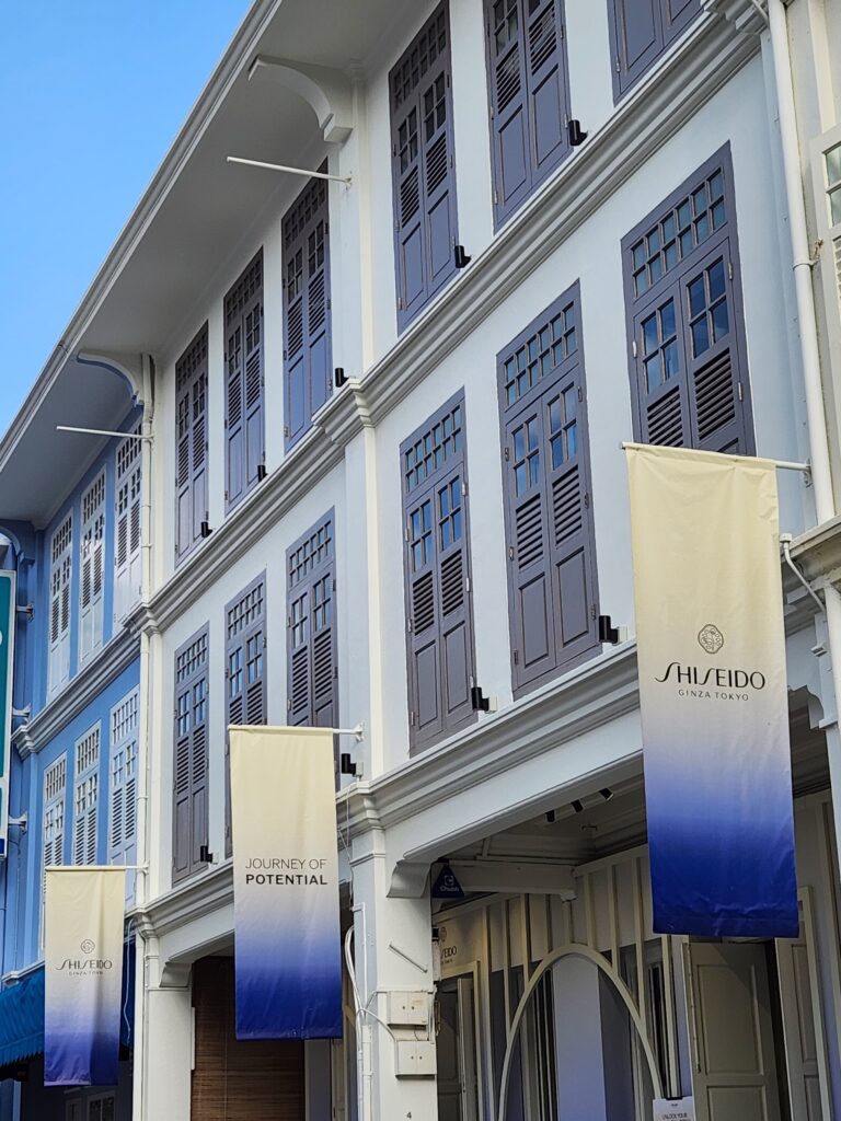
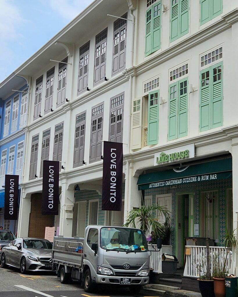
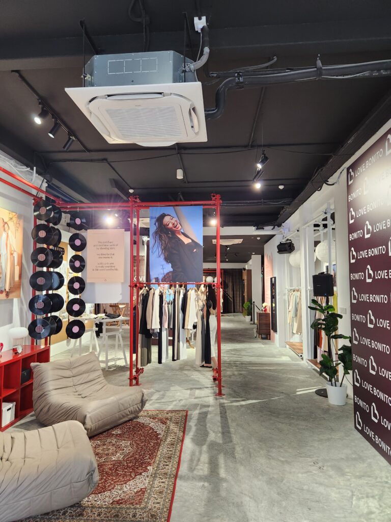
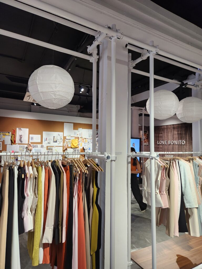
At 4 Jiak Chuan Road, MEIR Collective was proud to welcome three very distinct brands into its threshold - DIOR, Shiseido, and Love Bonito, for pop-up launches. This sparked some excitement on the possibilities of shophouse spaces as mediums for brands to engage with customers in a unique way, outside of the usual shopping mall space.
The interest in shophouses is still going strong and we think it will continue to do so, for as long as shophouses remain. Beyond just speaking about shophouses in terms of its monetary value, we decided to pen our thoughts here to discuss the deeper value of shophouses that we feel is the anchor for its consistent demand.
The Beauty of "Chancing Upon"
Shophouses are a platform for brands to build their own world outside of the world of the shopping mall and its rules. Instead of having to draw attention in a cluttered commercial space, the shophouse offers a quieter, charming experience. Customers can stumble upon brands situated in a historic, quaint enclave. The pleasant surprise of “chancing upon” a brand you did not expect to see in a heritage shophouse elevates the retail experience, arouses curiosity and helps to place brands in a different light.
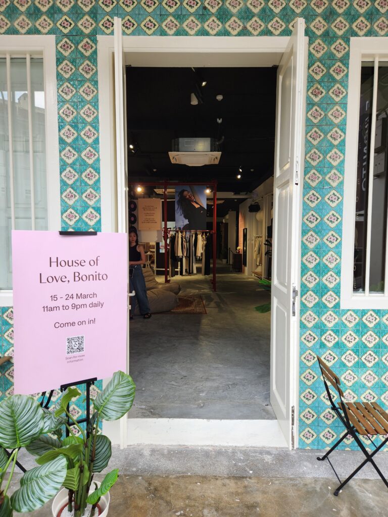
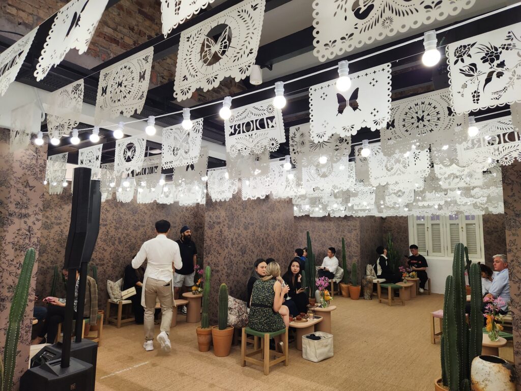
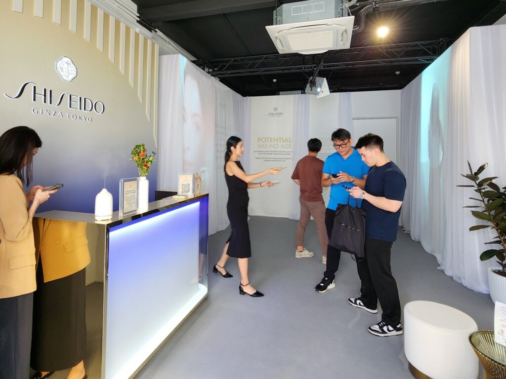
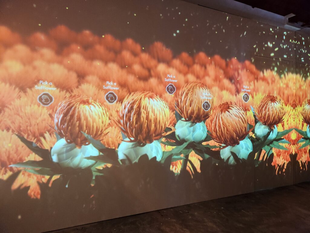
Being in a shophouse presents endless possibilities - brands can build any kind of world they want inside the shophouse, from an exclusive launch of a luxury product line to the celebration of a new marketing campaign. Here are three different campaigns that left their mark at MEIR’s Jiak Chuan shophouse:
The World of Dior
The World of Shiseido
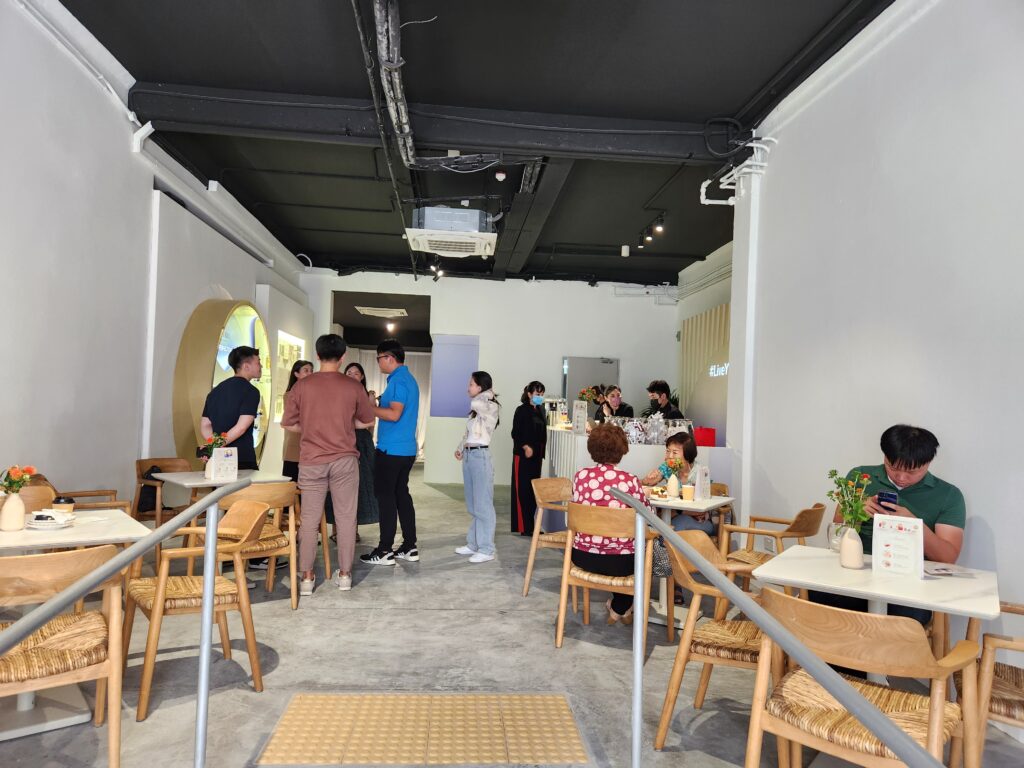
The World of Love, Bonito
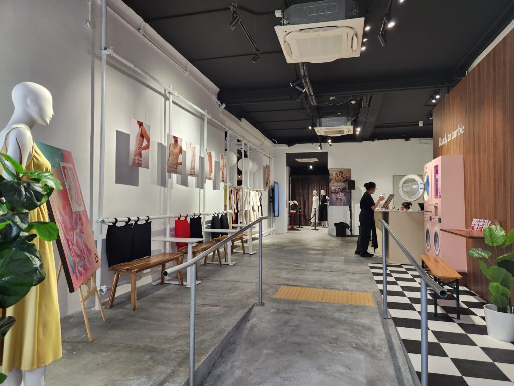
Leveraging our heritage to build meaningful spaces
Shopping malls may present homogeneous experiences - most of the time, the same few anchor tenants can be found in the malls around our tiny island. But shophouses are a unique Southeast Asian story of our shared history and culture. Anyone can build a shiny new shopping mall with sky gardens, water features and technological marvels, but to create a whole new world in a heritage shophouse that has been repurposed meaningfully is a satisfying accomplishment.
Heritage shophouses are the medium and platform to connect brands, investors, landlords and the community. More than just relics that we look upon through lenses of nostalgia, Afternaut and MEIR are repurposing pieces of Singapore's history to make them relevant, adaptable, and meaningful for present and future generations. The Afternaut too is building our own world in our new shophouse office at 71 Kampong Bahru, and we can’t wait to show it to you once it’s ready.
Follow us on LinkedIn and Instagram for updates.
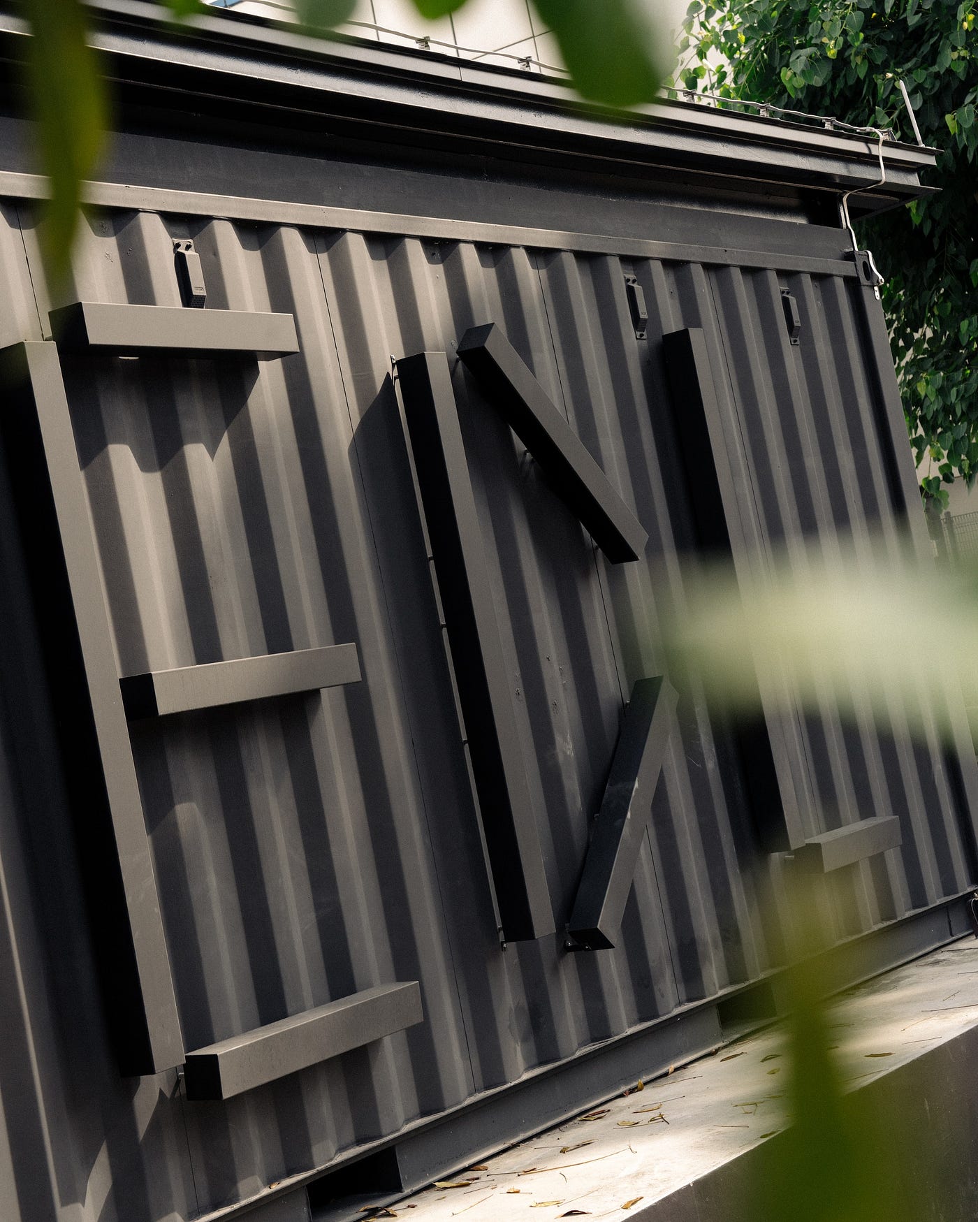
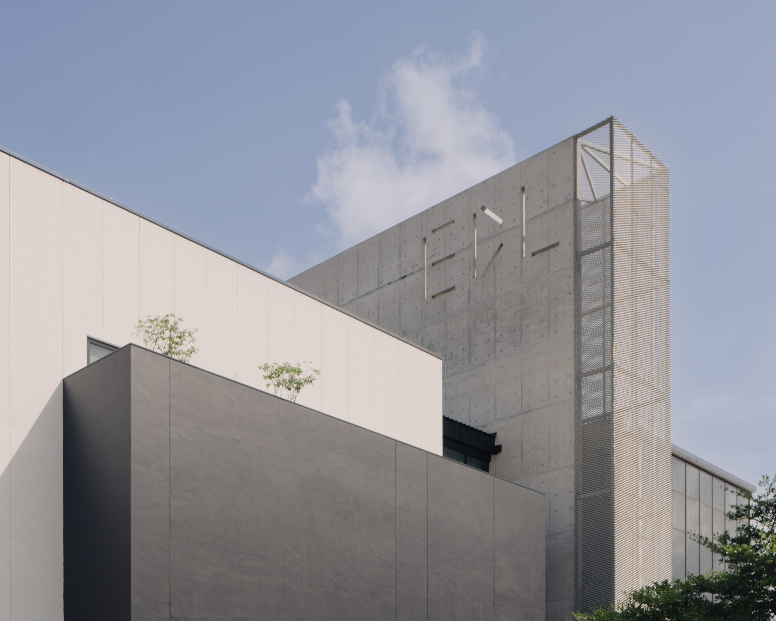
The long awaited EDL Regional Headquarters at 17 Woodlands Terrace is officially open! The launch of this new building was a long time coming but this innovative space that blends elements of digital, experiential, and spatial design is one that is well worth the wait. The EDL Regional Headquarters houses the gallery, production workshop and office space of the different EDL business units.
Having designed their first showroom at Sungei Kadut and continually collaborating with the EDL team on several projects over the years, we were granted the unique opportunity of witnessing the growth of EDL as an organisation and contributing to their journey into becoming the laminates brand that they are today.
Transforming the Original Sungei Kadut Showroom Into the Ideal Laminates Showroom
In our collaboration with the EDL team for their former Sungei Kadut Showroom, our core focus was on tackling on-ground issues that had a direct impact on customer experience within the space and by extension, the business’ bottom-line. Our goal at the time was to simply bring the EDL experience to the ideal state where customers — both designers and the general public — would leave with a positive impression as well as a clearer understanding of EDL’s offerings.
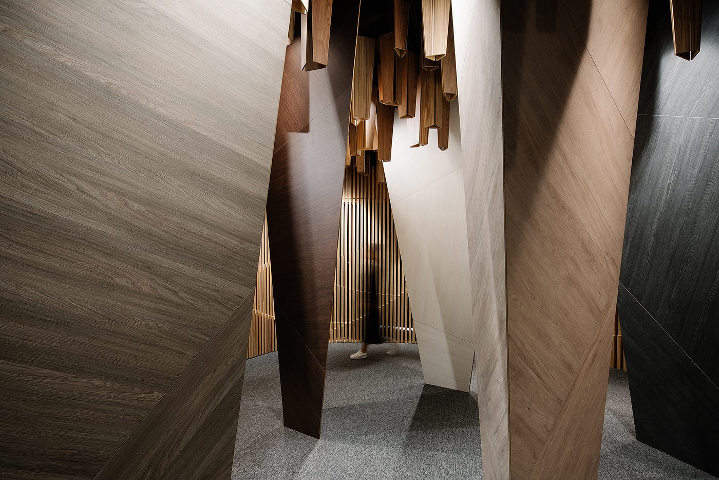
A collaborative effort to improve the spatial experience.
We first started by improving customer experience. Alongside the EDL team, we developed ways to train their in-store staff. Not only were staff educated with extensive product knowledge, they were also empowered to give product recommendations to visitors, thereby enhancing both staff and customer experience within the space. With the support of experienced staff members, customers would no longer suffer from the paradox of choice.
By intentionally transforming the showroom into the semblance of an art gallery, customers could experience in full the possibilities of laminate materials. Within the space, lighting was carefully calibrated in the same way one would light artwork to highlight the qualities of the materials. This experiential approach to introducing EDL products also allowed visitors to explore the space and materials without the guidance, thereby reducing the toll on sales staff. It was this unique and memorable gallery experience that also set EDL apart as a laminates brand, leaving a lasting impression on visitors from both the design industry and the general public.

A community space that sparks collaborations & creativity
The EDL folks have always had a passion for engaging different designers in different conversations. Hence, the primary space where one enters the showroom was occasionally used as a venue to feature different collaborations as well as for staff to showcase their work and passion.
We made sure to preserve and carry this over to the new EDL Regional Headquarters as well.

A beautiful space, well-loved by the public
The Sungei Kadut Showroom was exceedingly well-received. On Google, the showroom garnered a 4.4 star rating by the general public, and many left positive comments about their experience within the space, and with the well-trained staff members.
“Even without an ID, we didn’t feel lost at EDL thanks to Kelvin. He was really helpful and knowledgeable, making great suggestions. We had a great experience at the cozy and beautiful library.” said Ax Xu, a member of the public who visited the showroom.
Our efforts in the old Sungei Kadut Showroom laid the foundation and paved the path for the new EDL Regional Headquarters in 17 Woodlands Terrace.
Building Towards Greater Heights With the New EDL Regional Headquarters
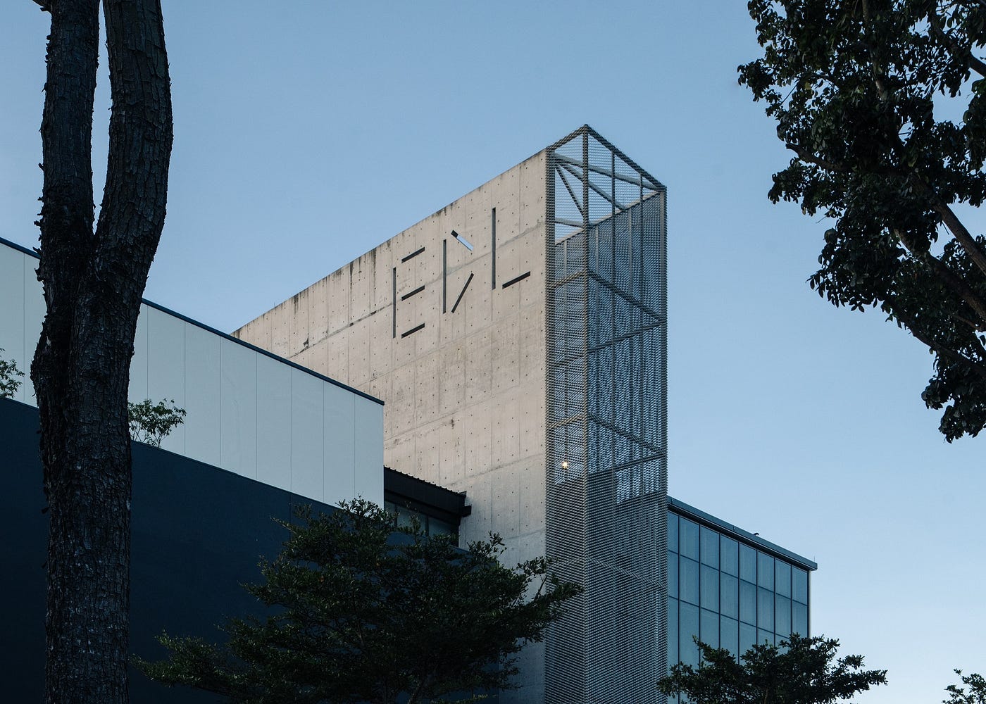
With the new EDL Regional Headquarters, we began implementing elements that would take EDL to the next phase of their business and brand — some of these being elements that we wanted for the original space at Sungei Kadut but were ultimately unable to bring to reality due to priorities and constraints at the time.
With our learnings from the previous project, we knew that we had to once again ensure that the new showroom would be a destination-driven space; the new EDL Regional Headquarters was located in an area just as remote as — if not more remote than — the last showroom. In order to draw visitors in and make them feel excited to visit, we would have to create an experience that would give them meaning beyond just buying a product.
Read on to find out what has been changed and improved in the new EDL Regional Headquarters.
Just as we did in the Sungei Kadut Showroom, minute attention was paid to the design of the interior space but this time around, the exteriors were given the same treatment as well.
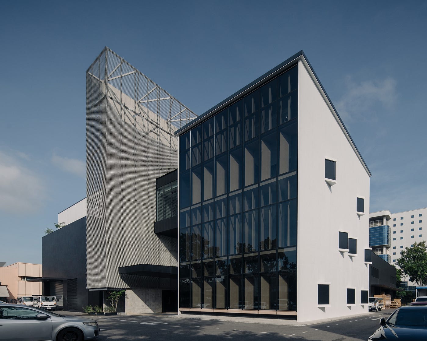
Architecturally, we envisioned the building as an expression of the organisation being a sum of different parts. Exterior volumes were designed with elements representative of the different business units in mind to allow visitors to differentiate and identify the moving parts that come together to form EDL. Each business function was represented through different material applications with interlocking volumes that mirror the interconnected business functions.
The front facade was expressed almost like a 3D storybook unfolding with each chapter defined uniquely yet intertwined. The central off-form concrete and metal mesh stair core that connects the different volumes vertically, is used as the architectural beacon for the building; an abstraction of their iconic laminate catalogue.

We curated a user experience that would transform the new showroom into one that would inspire and engage different stakeholders — be it homeowners, designers, or contractors.
As in the old showroom, the new EDL gallery is a collection of different spaces; every room is unique in its storytelling and experience. However, being larger than the last, the new showroom has spaces embedded within spaces to allow for a better experience. Stepping into the cabin, which contains a kitchen, a bathroom and a living room, is akin to stepping into a real home.
We maintained the porosity between spaces to allow for curated visual linkages throughout the space while maintaining a level of intrigue and curiosity. The slow unfolding of the space ensures that visitors are not overwhelmed by the sheer volume of products available, and allows them to take their time in exploring the gallery.
Most rooms possess more than a single entrance and exit, and the fluidity of the space allows users to seamlessly transition from one room to another without feeling lost or disoriented. The interconnected nature of the gallery also ensures that there are no dead-end spaces within the space.
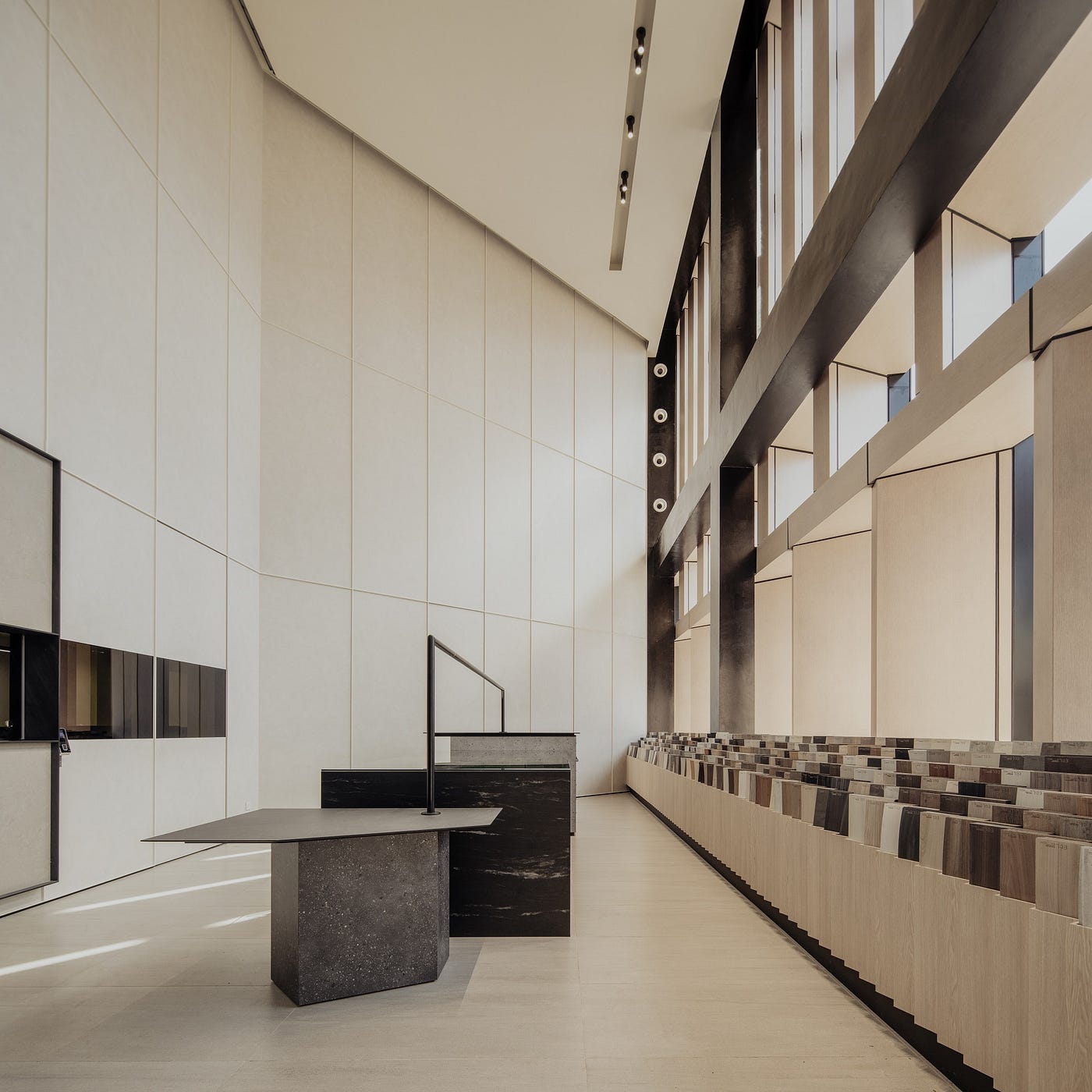
Finally, we deep-dived into how people wayfind and visually orient themselves and configured unique routes to ensure that different user profiles need not cross paths in their individual journeys through the building. For example, for visitors simply stopping over for material samples, they can easily grab their orders and go without having to travel up to the main gallery space as samples are also placed in the reception area.
This approach helps with traffic management and prevents crowding within the galleries.
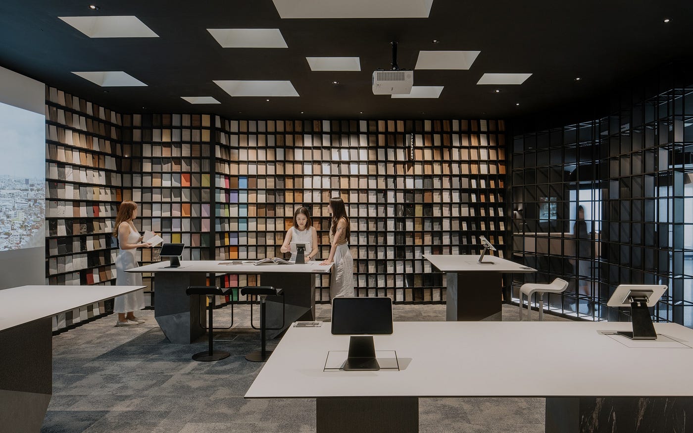
Digital elements were incorporated to complement the physical and experiential layers that make up the unique EDL gallery experience.
As it was well-received in the last showroom, we knew we wanted to maintain the element of a space that offers visitors that element of a self-curated customer journey but this time, incorporate more educational layers to visitors.
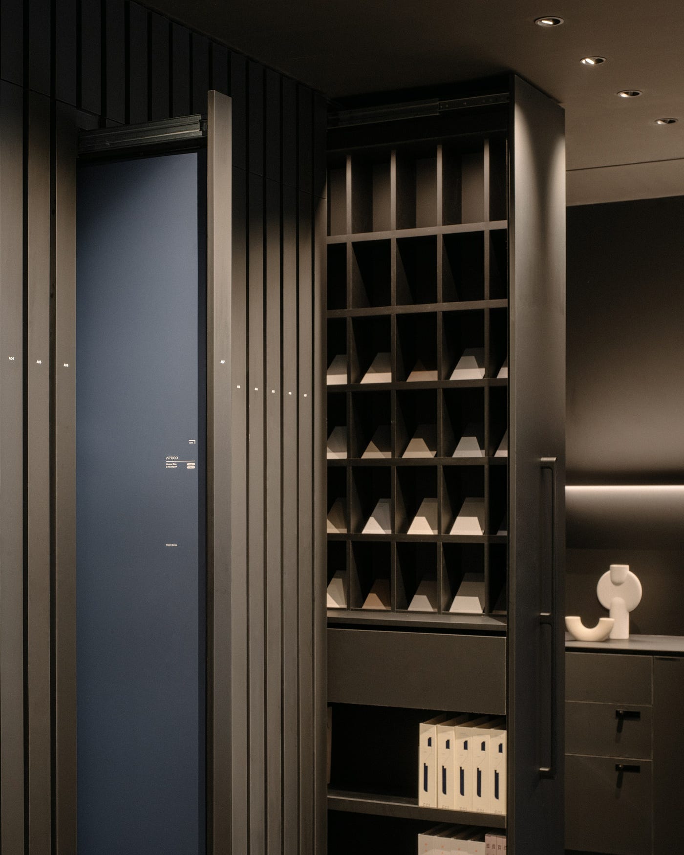
With this intention, we derived material larders with interactive informative features embedded within. Some pull-outs would feature videos that showcase the products in a myriad of ways and shine a different light on the product for visiting customers. Others showcase information on what the material is, the intended use case, and perhaps, more innovative use-case suggestions for visitors to consider. These larders add a different dimension to the new gallery and elevates the new space.
Going beyond physical spaces, we also saw an opportunity for us to explore digital accompaniments. These digital layers provide crucial information on products and the various gallery zones to make the entire experience more holistic. With the incorporation of these elements, every user is given the right or ability to curate their own experience in this gallery and the journey is never one that is linear.
There are a lot more layers and depth that we were trying to push for in this new project. We wanted to create a world made up of digital, physical and experiential layers.
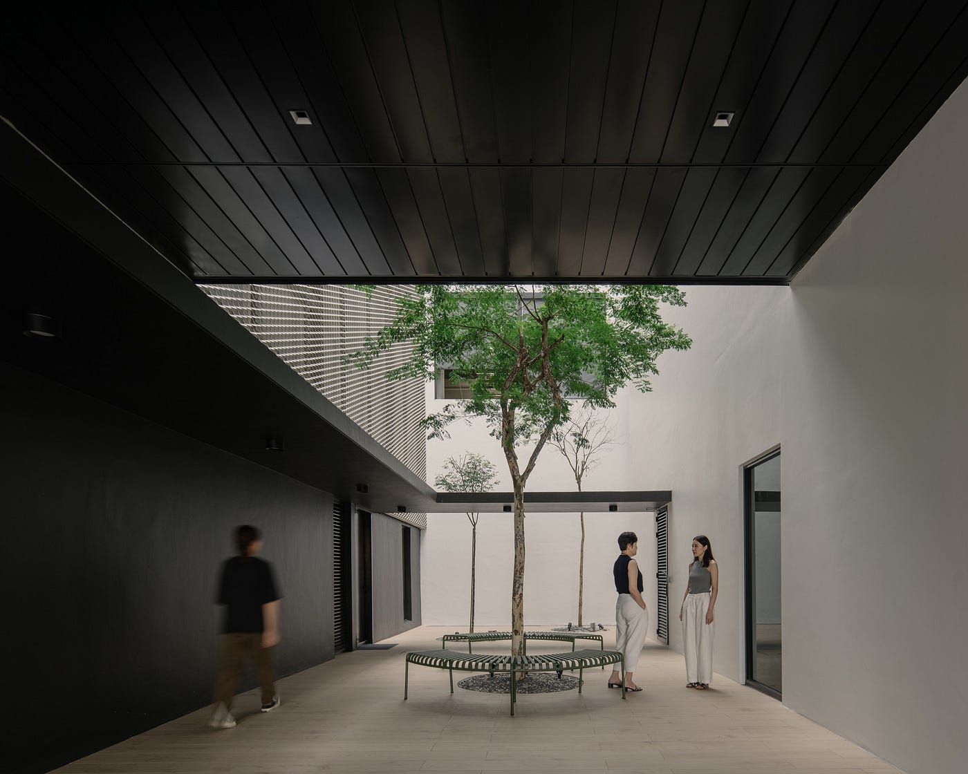
The benefits of an enhanced working experience were extended to visitors as well.
This focus on building human-centric spaces was extended to the rest of the gallery tool.
In the old showroom, we noticed that visitors, having already taken the time to travel all the way down to the space, would often opt to remain there for the rest of the day to optimise their time. Many designers would in fact arrange to meet different clients within the showroom throughout the course of the day.
Taking this into consideration, we enhanced all key areas of the new showroom — the Library, the Canopy, and the Cabin — with collaborative features that allow visitors to engage in productive design conversations while enjoying easy access to product samples. The space functions almost like a working space for visitors, complete with charging ports, meeting areas, and work spaces.

Not only are samples just a larder, a tree, or a shelf away, information is also neatly organised in accordance with the product library. Related parts and products are also placed in close proximity.
These days, gallery ambassadors often dwell and work within these key areas, within easy reach of visitors in need of help.

The space was consciously transformed into an inspiration hub for creative repurposing of material off-cuts.
In the years past, EDL consistently prioritised and adopted sustainability measures such as reusing material offcuts. From creating coaster sets that come together to form unique decorative pieces to building art murals with material off-cuts, we’ve seen them experiment with repurposed materials across different scales throughout our collaboration.
Now with their own production arm, they have also been implementing waste reduction methods in their own facilities.
Knowing this, we supported EDL in translating their passion for sustainability into the design of their new headquarters. By showcasing how by-products and offcuts from various different projects can be transformed into meaningful elements within a space such as feature walls or furniture pieces, we hoped to create a space that would inspire people to jump on the bandwagon of creating a more sustainable and inclusive future.
We incorporated production offcuts from EDL-produced kitchen and bathroom tops in their new showroom gallery as a way to showcase alternative uses for offcuts, and an art mural was also created with laminate offcuts and proudly displayed within the central lift lobby.
The space in front of the lift lobby, preluding to the gallery, doubles as an exhibition space for the EDL team to showcase their latest sustainable inventions, but can also be used to showcase other designers’ works, or host graduates’ projects as well.
A product of synergy and close collaboration
“Over the years as we were seeding this project, our frequent conversations with the client allowed us to refine and build upon these different ideas and components,” said Gwen Tan, Design Principal at The Afternaut, “On this front, I think synergy and chemistry between ourselves and the client had a huge part to play.”
It was through our many conversations with the client that we uncovered the many different opportunities and elements that we could incorporate into the new gallery. These conversations are still ongoing, even now as we’ve arrived at the end of the project.
All in all, the new EDL Gallery features all of the best parts of the previous showroom — in terms of its well-considered user journeys, human-centric design, and experiential approach — but is now enhanced with digital elements, collaborative spaces for visitors, as well as spaces within and even within the building’s compound for contemplation that elevate the space to a higher level.
The EDL Regional Headquarters is a place that seeks to deliver a high quality of liveable spaces for both employees and guest users through careful, conscious design.
For more information on this project, please visit our website, and if you’d like to work together, reach out to us via hello@theafternaut.com
The Afternaut Group Pte Ltd. 2024

